Denta32


2nd May, 2017
Illustrator
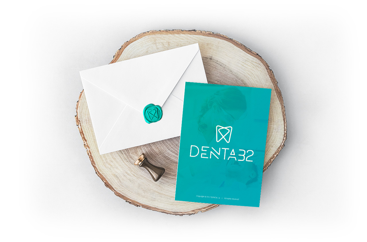
The logo is simple, clean and elegant. “Denta” refers tooth and “32” represents the number of teeth that every adult human possess. The two triangles, which appear like teeth represent any two entities that need to connect. This could be dentists and patients, hospitals and insurers, or any other entities who wish to interact so that they can fulfil their health needs. The colour combination, blue and green, convey a sense of care and reliability, which is the most significant factor in the healthcare sector.
Triangles — a visual representation of “the pinnacle of success”, with round edge corners reflect a platform which is friendly, caring and approachable. The combination of two triangles symbolises fruitful correlation between two entities revolving around oral healthcare.